Offer Creation Wizard
This project involved restructuring and improving the user path when creating a new offer.
The project included auditing the current state and creating a solution to enhance the user experience.
The project included auditing the current state and creating a solution to enhance the user experience.
My Role:
UX DESIGNER
UI DESIGNER
Project Duration:
3 MONTHS
Tools:
FIGMA
GITHUB
Google sheets
Confluence
SLACK
Platforms:
Web Application
About EOSC

The EOSC Marketplace is a virtual environment where researchers can find and share research resources, such as data, tools, and services. It is part of the European Open Science Cloud (EOSC) initiative, which aims to create a common, open, and interoperable ecosystem for research data in Europe. From a provider's perspective, the EOSC Marketplace is a valuable platform to
showcase and offer their services to a wide audience of potential users. The Marketplace's catalogue make it easy for researchers to find the resources they need, and providers can be confident that their services will be seen by the right people.
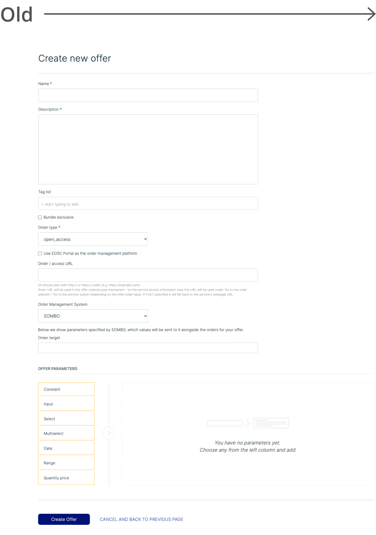
Why redesign?
1
2
The old offer creation form was really hard to understand. Users often gave up on making offers because of it.
The visual design needed to be changed to make it more attractive and consistent with the website's design.
The Process
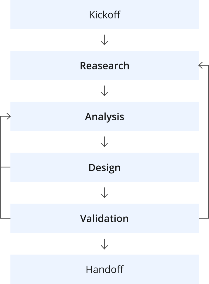
We chose this process for its user-centric approach and iterative nature. Iterations allow for continuous improvement based on feedback, ensuring the final product meets user needs effectively.
Information Architecture
Based on the information gathered during the audit, reviewing project requirements and constraints, and organising a meeting with the team to plan the project,
I was able to create the project's information architecture.
User flow - New Offer Wizard

Step by Step - Linear Structure

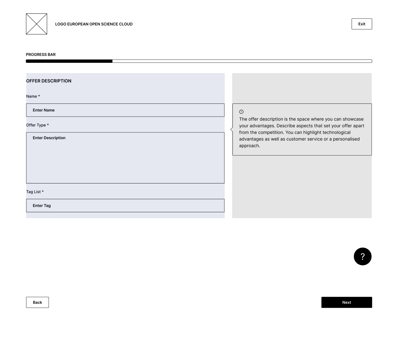
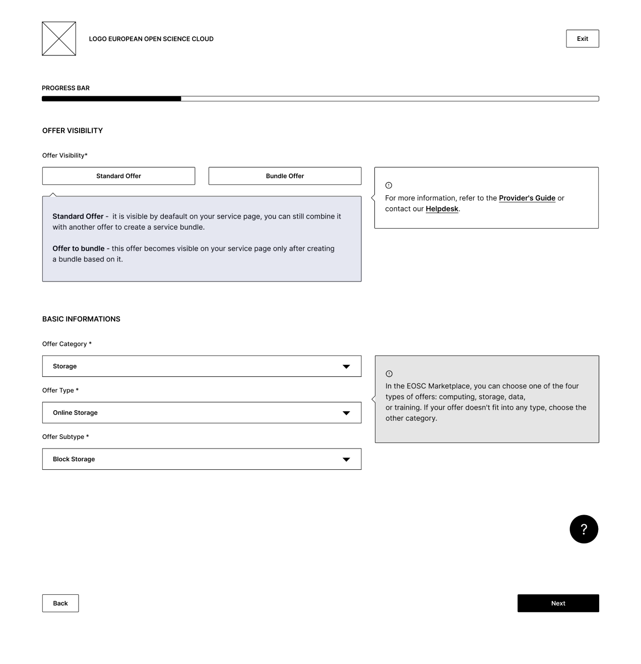
Low-Fidelity Wireframing
At the low fidelity stage, I developed a solution that will be user friendly and meets the requirements and constraints related to coding.
How I did it?
▪︎
Used pre-made wireframe kit to speed up work and avoid errors
▪︎
Applied only two colors to simplify and better present hierarchy
▪︎
Used wireframe prototype for testing and catching errors before mockup production.
What I did?
▪︎
Adapting to necessary compromises without sacrificing user experience.
▪︎
Balancing design aspirations with technical limitations
▪︎
Ensuring design cohesion with the overall website aesthetic.
How I did it?
Designing the page layout, I mainly focused on three key aspects
▪︎
I made sure all the elements fit into grid system that we use
▪︎
I adjusted the length of the text and elements. I used the optimal line length principle to make it easier for users to process
▪︎
I divided the layout of the page into two columns, which helped clarify the hierarchy of the elements
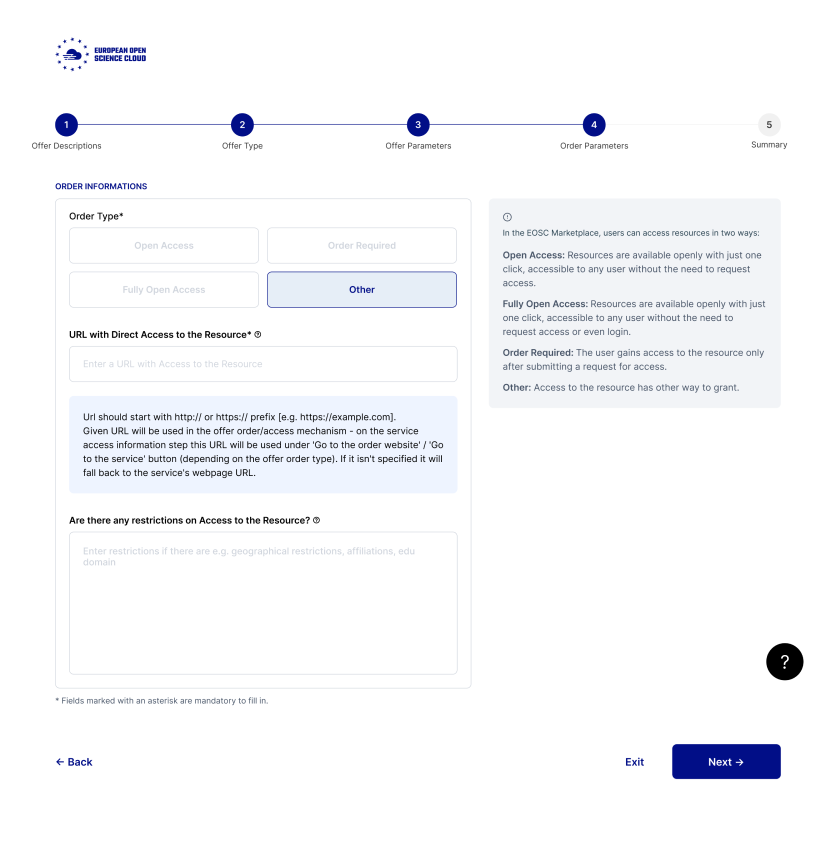
Tooltips
I implemented two types of tooltips
to clearly differentiate messages based on whether they provide additional information or are crucial.
to clearly differentiate messages based on whether they provide additional information or are crucial.
▪︎
The main tooltip presents crucial user-centered information.
▪︎
The secondary tooltip provides additional information to aid understanding of the process but isn't crucial.
Key Insights
▪︎
I spotted problems with the form fields order, which I managed to fix in the early phase of the project.
▪︎
I collected thoughts from the team and users about how the final design should look.
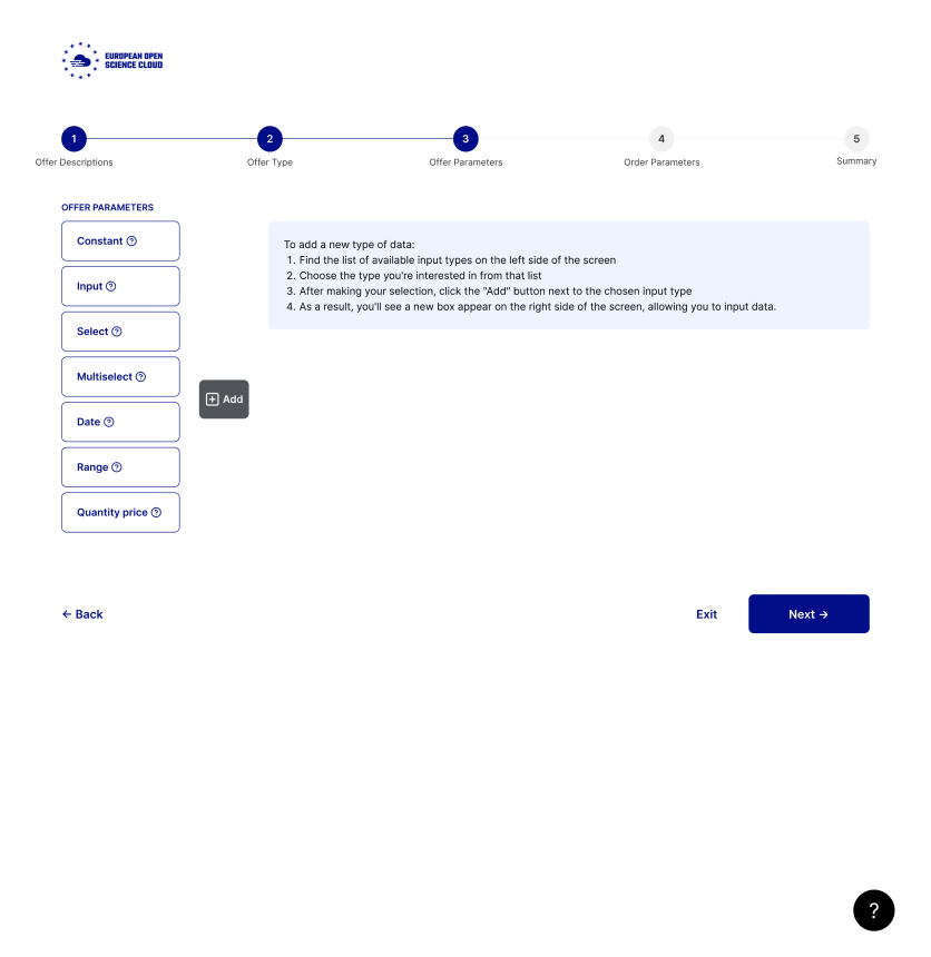
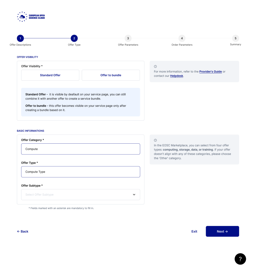
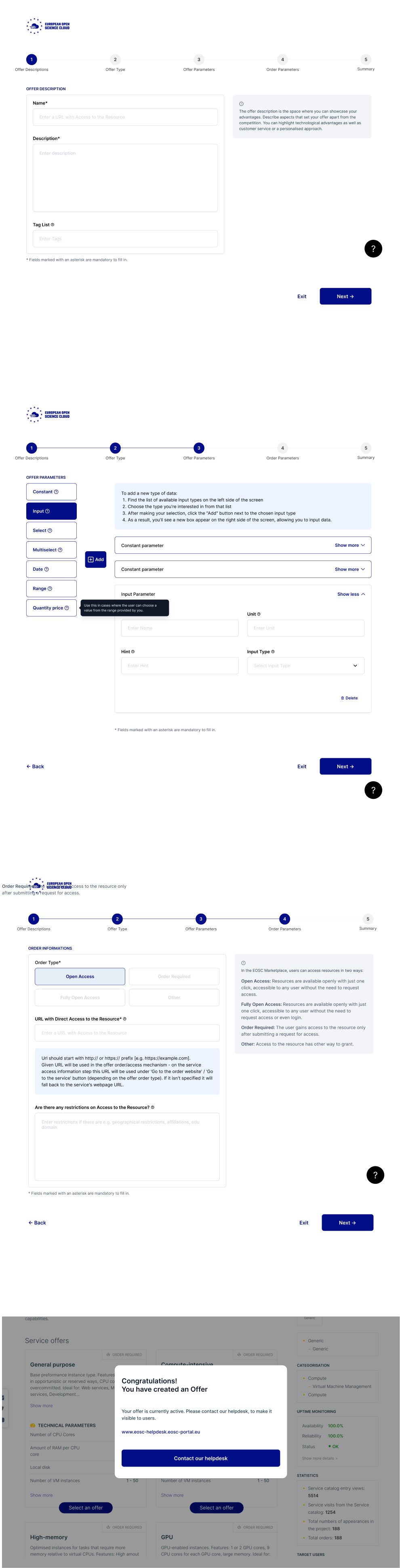
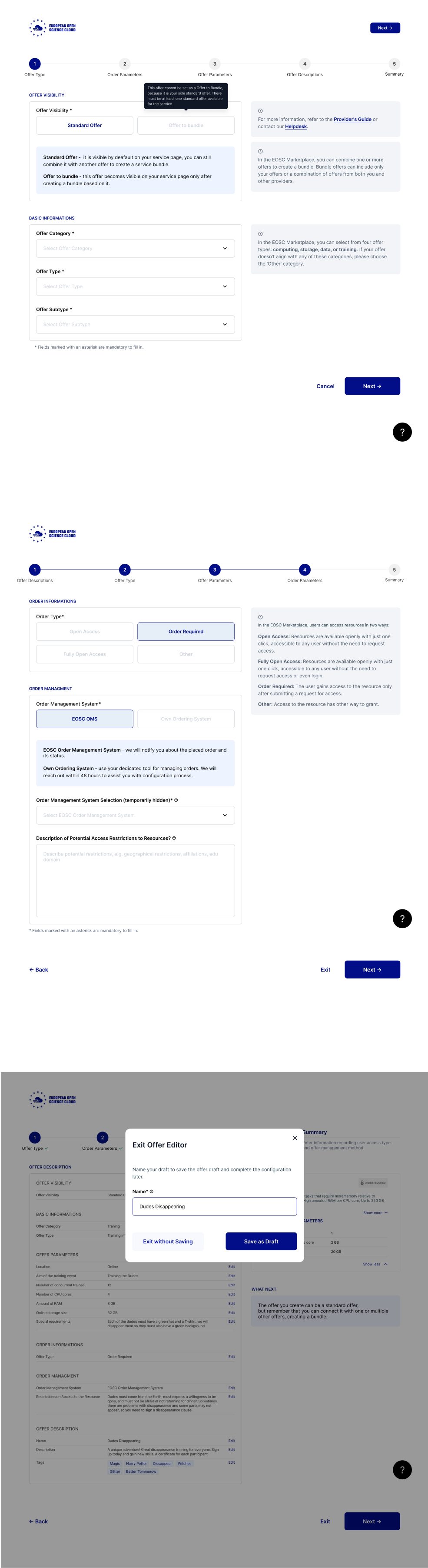
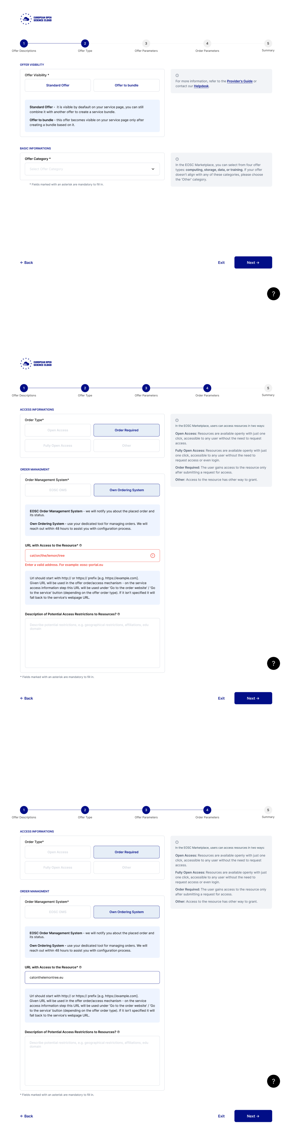
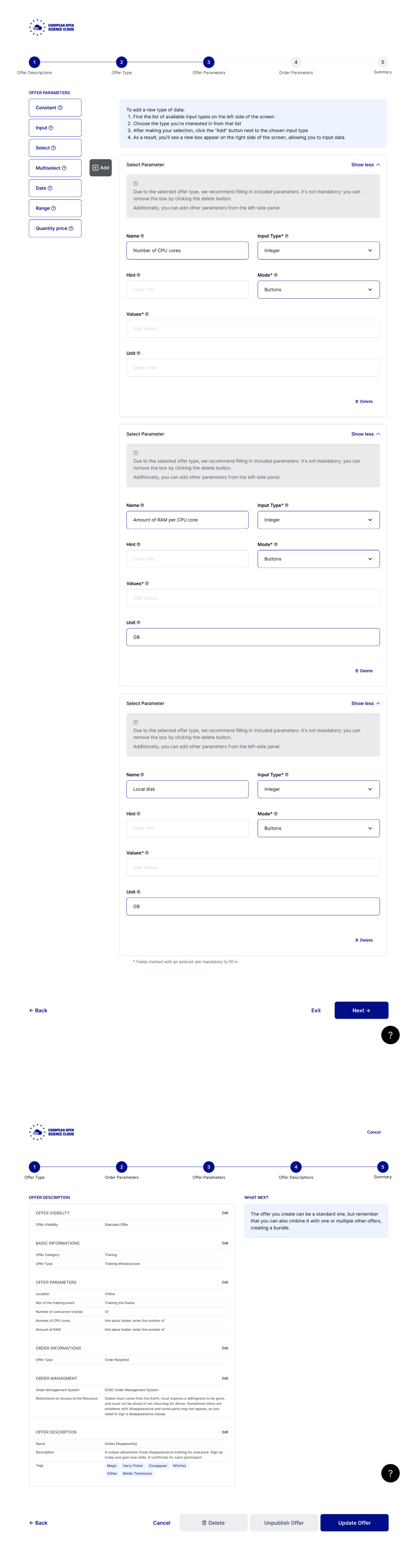
High-Fidelity Mockups
After creating a detailed plan of information architecture and low-fidelity wireframes, I designed mockups using existing components from our portal while keeping the same look and feel of the service.
Colors
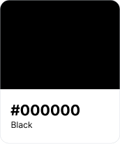
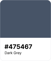
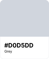
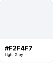
Natural
Neutral colors are used as main colors for text, separators, strokes, and background colors.

Primary
The primary color is foundation of our visual identity, providing recognition and consistency.
Error
Red is used in form validations, error messages, and critical notifications to ensure users quickly notice and address problems
Typography
Font:
Inter
Regular:
AaBbCcDd
Semibold:
AaBbCcDd
Spacing & Grid
While designing, to make the project as easy as possible to develop later, I used the grid and spacing system from Bootstrap 4.4.1. This included a 12-column grid and a 30px gutter.

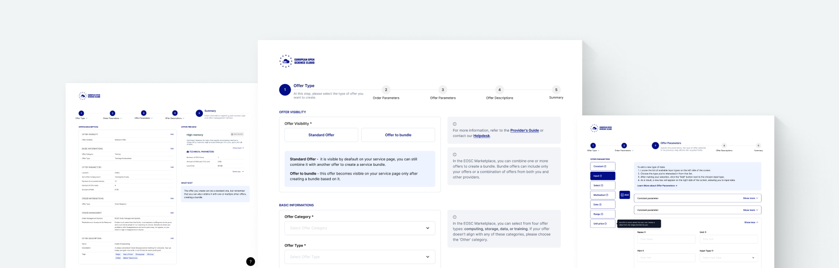
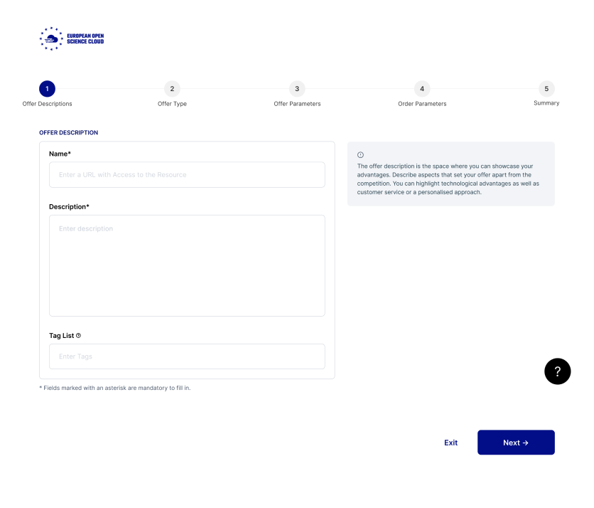
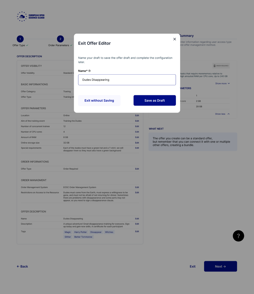
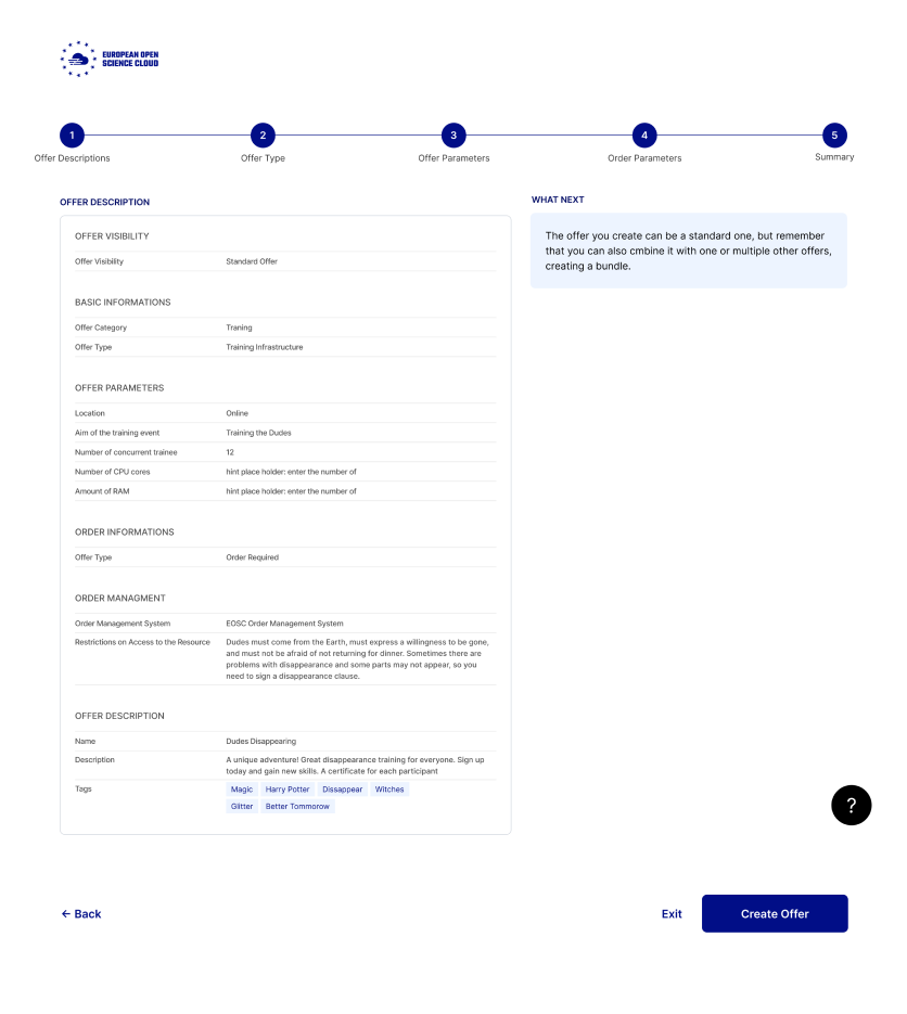
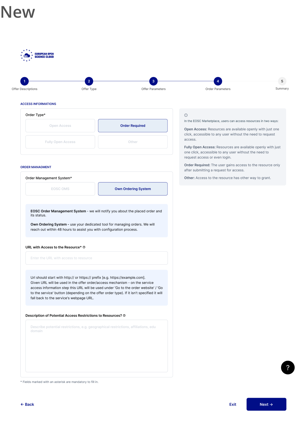
Final UI
Summary
During the project, I not only gained insights into information architecture
and effective documentation but also enhanced my skills as a UX designer. Additionally, I became a more valuable team member by improving my collaboration and communication abilities.
and effective documentation but also enhanced my skills as a UX designer. Additionally, I became a more valuable team member by improving my collaboration and communication abilities.